Manipping Tutorial
February 6th, 2006
| Note: Since this is several years old, some external links may be outdated, and instructions likely refer to an older version of Photoshop. However, there's more than enough useful information in here to get you going! |
This tutorial is based on Photoshop, but I believe the effects can be reconstructed with most common painting programs. I will presume a certain knowledge of the functions in my tutorial. If you wish to learn using Photoshop, please refer to one of the many tutorials around on that subject.
As I mentioned in the Behind the Scenes to Brothers in Arms, the first step is knowing what you want to do. There are two options for this: either an idea what the picture should be, perhaps an illustration; or, far more common for manipping, a picture itself is the inspiration. I also have to say that it is definitely easier to have the picture first. If you have a certain illustration in mind, you will almost definitely have to resort to painting to achieve your desired result.
In either case, if you want to do a manip, you will have to find pictures you want to use (no, really!). In my case, this means an extensive gay porn collection a well-sorted reference archive. Since the normal case of a manip entails nekkid men, you will often come across cocks, shots that do not have the aesthetic decency for which you may wish to strive. (e.g. I personally tend to avoid really explicit content in my pictures, but my collection is very, very NC-17)
Although these are no XXX Porn pages with pop-ups and referrals etc., please in general assume that all these links are to be considered adult-rated and not work-safe!
This picture has an extensive collection of men kissing and engaged in all manners of naughty acts; but no plain hardcore genital close-ups.
http://www.freddyandeddy.com/galleries/menkissing/gallery01/mkgalllery1.htm
Another good page which I frequently visited for reference shots is this. There is no frontal nudity in the shots here, so although it is a smaller archive, you may find pictures to work with more easily.
http://www.chadzboyz.net/html/kissing.html
This is a site I was recommended recently; it is split into several categories and has a wonderful collection of absolutely gorgeous pictures there. I recognised many of my favourites there; favourites which I had spent hours collecting from various sources.
http://www.icyhothunks.com/
You can also search for stock images and will find quite a few suitable pictures to work with.
http://www.fotosearch.com/
Here are some more sources.
http://cuteandsexy.de/
http://www.manpaper.com/
http://www.manfanpics.blogspot.com/
Another good source are webpages of photographers. There are plenty of erotic photographers around, and such pictures usually already have a fine aesthetic quality about them. Here is one example, but with a bit of searching, you can find plenty of great sources.
http://www.jackslomovits.com
There are also LJ communities, such as boy_touching or gay1photos
1.
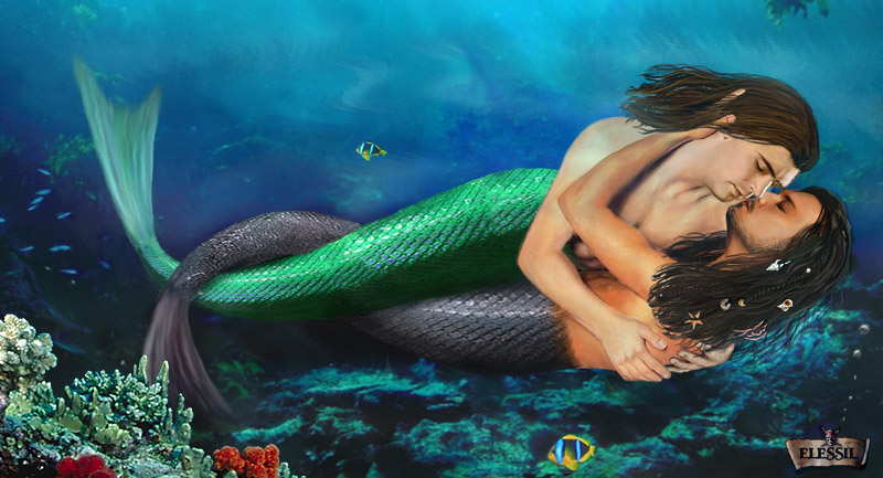
Personally, I try to look for a "mood" in a picture. I see the potential for a story in a picture, and that story is what I want to tell in the result. This will be different for whatever you want to manip in the first place. Asssuming you wish to make a manip of a pairing, the nature of that pairing will determine what picture may tell an apt story. This is something for which I cannot give any instructions. This is something you have to know.
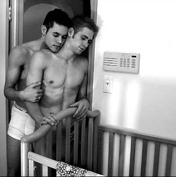
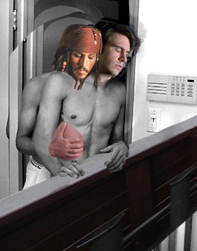
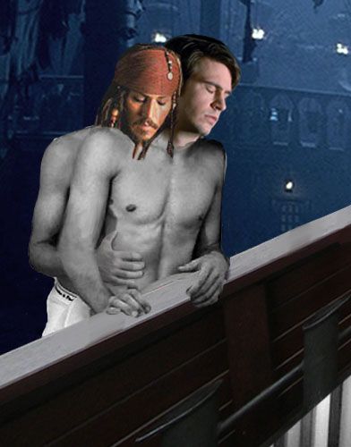
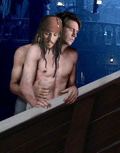
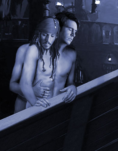
This is the picture I chose this time. It was not on my current list of pictures with which I had planned to work, but it was one I saw and thought could work as a manip and still have a story I wanted to tell. When I looked at it, some weird part of my brain already inserted moonlight, a ship's railing and a mast in the background. That part of my brain is a very scary place, but one that all manippers should have and embrace. It is the key to not starting something that, no matter how good the execution, you won't like.
This also entails the decision of who will be who. This can be determined by factors such as size, build, etc., but also by the role in the 'story'. For example, here I wanted Jack to be the one standing in the back, although clearly, James is the taller of the two. When selecting a picture, I usually immediately see who will be who.
2.
-Angle
-Perspective
-Lighting
The first two are easy to see, either with training or by pasting the shot in and seeing if it fits. Lighting can be a bit trickier and require some training and consideration. Just look. Can the light of the body shot and the face shot originate at the same point? (if you look closely, you will see that I cheated a bit with James' face in this picture. But since moonlight is a diffuse light, and the difference isn't blatant, I kept it. In the end, it comes down to you, and if possible a picture beta to judge if it fits together)
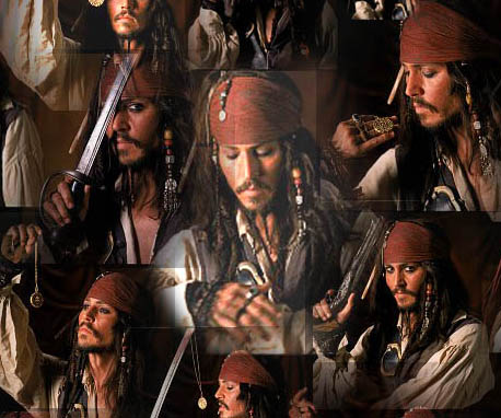
Another aspect of this choice is the expression. Even if the three technical aspects fit, if the expression doesn't, your manip won't work as you want it to. Here you have to think again: What is it that you want to show? Tenderness? Pleasure? Long-suffering annoyance? Such shots can be taken out of context. For example, the classical "orgasm" shots usually are from quite different scenes in films. Ironically enough, a scream of pain often is a good guess. You thought POTC wasn't a naughty movie? Let me prove you wrong.
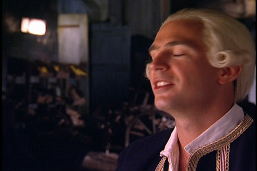
My point? Look closely. What do you want to convey? Can the shot you choose convey that? Does it fit? Common sources for character shots are screencaps and promotion stills. Another option is to take pictures from the actors' other movies. With Jack Davenport, for example, this is easy, and I certainly used more shots of his other characters than from POTC.
Jack Sparrow however, looks quite different from many other Johnny Depp movies. I have sometimes "jack-ified" another Johnny face, which almost means repainting. (what helps in such a situation is to actually imagine to put on make-up. Imagine the black brush as a kohl pencil) However, there are films where Johnny Depp looks more like Jack than in others. "The Man Who Cried" is a good example.
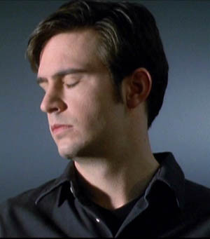
With other characters, it may be even more difficult. I am referring to minor characters such as Groves and Gillette. (those for whom I added this part, you know who you are!) They only have short scenes from which to gain caps, and the net does not yield up many shots. One option to deal with this is to start differently: You start with a face of the character you want to use and look for bodies that fit. However, this can be a rather tedious process.
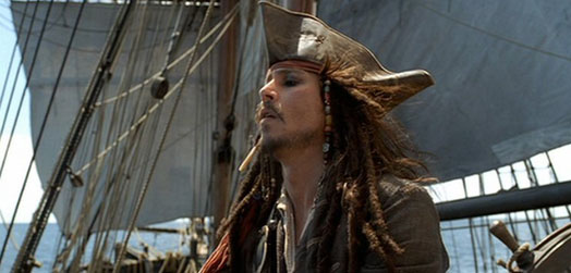
Another option is to kill two flies with one swat; to take the base shot from the movie itself. For example, taking a shot of Gillette as he is in the movie, and just add Will to it. In this case step 1 and part of step 2 are merged. It is not as flexible, but tends to be easier if you find a fitting shot in the movie. (This was what I did in my King Arthur manip; Arthur+hand is from a promo still, I merely edited some things and put in Lancelot)
These first two steps decide how the manip will look. Do them carefully! I mean it!
3.
Here I already added the ship's rail, admittedly because I wanted to cover the cradle. It didn't fit James and Jack for me, and I wanted to get it out of the picture, so to speak. For this, I used an element from a personal photo, although it's no big deal.
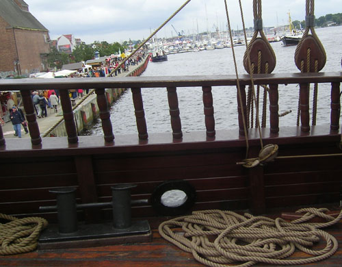
I tend to be sloppy with background/foreground elements, which is one of my nastier artistic habits. I'm just so blatantly figure-focused that I consider the background more as an obstacle than anything else. I'm working on this, and starting with Sea Men, I've began taking more care about the backgrounds)
In general, make sure that they fit. A background should support a mood. It should, usually, neither alter nor disturb it. A very vital factor for this is contrast and colour. It can help your composition.
Usually, background elements are a lot more flexible. Here, for example, I used perspective adjustment and distortion tools to make the railing fit in. This is something you could never do with a face or a hand or such.
Don't merge your layers unless they really, really belong together. You may wish to resize, move or even remove elements, and you don't know when that will be. So keep a layer structure. And don't pick up my bad habits. Name them.
4.
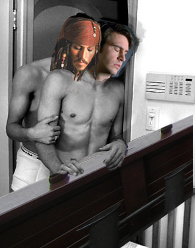
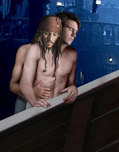
This can often result in troubles with layers, if you want part of a layer to be on top of another layer; the other part beneath it. Here, I wanted James' body behind the rail, but his hands above it. I decided to erase the according part of the rail-layer; because it is a simple structure which I could easily reconstruct in case I would move it or similar.
5.
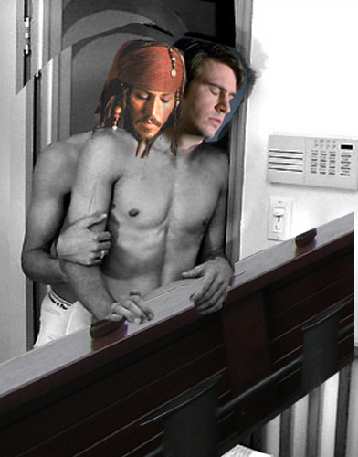
To do so, I selected the rough area of the man in the back, copied and pasted it (on a new layer on top of the old) and moved it down. This resulted in covering parts of "James". Therefore, I erased those parts of the new layer, leaving "James" as he was before while "Jack" now was distinctly smaller. Of course, this also involved some head adjustments.
A problem of this "shrinking" was that that hand no longer fit. I had two choices: Either change the angle of the arm; or change where the hand goes. I decided for the latter.
However, that hand cupped something, it was not suitable for lying flat on the stomach. This could be solved by changing the fingers, but the easier manipping way is to bring in a new hand.
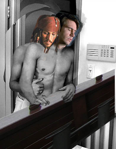
Hands are easy. There are plenty of them around on almost any photo. If in doubt, you can take a digital photo of your own hand.
Pasting in a new layer requires removing the excess. That had had plenty of skin to go with it. To remove it, I used a 100% opacity eraser, so the layer beneath it would show through again.
Also, because I knew what I would do with the colours later on, I made it black and white, so it would be easier to adjust and fit to the rest of the body.
Another part of linking is shadow. Things cast shadows on each other, and even if they are small, they are important for creating a sense of 3D. Here, I added the shadow of the hand with a simple dark brush on a layer beneath the hand.

6.
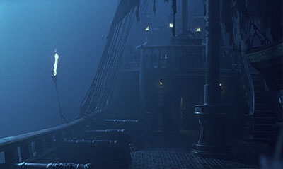
If you do the erasing right, you can now add your background as the lowermost layer, i.e. all other layers are "on top" of it. Here, I used the Pearl from a cap from the movie.
7.
The first step, in any case, is to create a basic colour layer. As a rule of thumn, if your b/w picture is light, try with a multiply setting, if it is rather dark, go for the "colour" setting. Experiment around. This is all I did here. One layer for "James", another for "Jack". It is easier to change things later if you use multiple layers.
Something I didn't do here was add additional highlights and shadows. This is however necessary if you aim for a regular colour scheme. I suggest doing it on an additional layer with a brush of a light and of a dark colour (not neccessarily black and light, on skin a light yellow and a dark red usually make for better effects) at about 20% opacity. As I mentioned above, this usually requires some anatomical/artistic knowledge. It's like shading in a painting. But if you want to, just try it out. Use an extra layer, and it can be removed within a second if you don't like the result. Or stick to b/w. This can achieve great results!
Another thing I did here was to play around some more with the background size and positioning, as well as completing the rail with copy&paste from the existing elements.
Here I did some more clean-up. Erase excess material from some layers; use the smudge tool at a low pressure (~10%) to smooth the noise and JPG artefacts. Also, I used the adjustment option in Image->Adjust->Hue/Saturation. This, as well as Brightness/Contrast can help to get different elements fit together without or with less manual work. Brightness/Contrast was what I used to give a bit more definition to the background.
A side effect of Contrast adjustments can be too high/too low saturation. If you increase Contrast, Saturation will also go up. You can counter this by first doing the contrast adjustment and then changing Saturation until it fits your expectations.
8.
And again, it comes down to linking. Making layers work together. Here, I took a blotch of colour and the smudge tool to blend James' neck with the body, working with semi-transparency (this is what you get when working with a brush on lower than 100% opacity, or smudging, erasing, etc...basically any tool) There needs to be a shadow from the head on the neck, so be sure to bear that in mind and don't smudge it away.
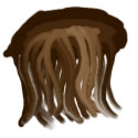
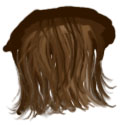
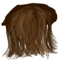
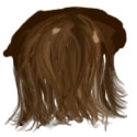
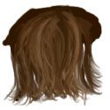
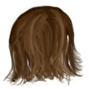
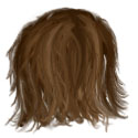
The less obvious form of linking is overlapping. This is what I mentioned before. Give things a three-dimensional order. The more complicated this "hierarchy" is, the more realistic your picture will likely look. Here, it seemed obvious to me that Jack's hair would fall forward across James' chest. Therefore (again on a layer of its own), I added hair. The longer hair is, the more it curls. And there are different types of hair. If, for example, you study Jack's hair, you will see that he has dreadlocks, woven braids of various thickness as well as hair hanging loose. He wears one long lock that reaches to his waist (the one with the red ribbon and the coin) Not all hair is the same length, same thickness or curliness. Try to imitate that. This does not mean looking where each single strand should go, but getting a general impression and trying to imitate it.
It also requires different shades. For this, you will have to apply a certain understanding of light; and the hair itself. Thin hair has finer highlights. Hair with strongly contrasted, thick strands will appear wet.
My personal favourite technique for drawing hair involves making a huge blotch of various shades of colour, and then using the smudge tool at 95-100% to "pull out" strands. First with a larger brush, then growing smaller. Highlights may need to be added in the end. (This is a two minute demonstration. I also did the hair in Sea Men, which I'm very satisfied with, like this, only that I spent several hours and multiple attempts on James' hair until I was satisfied with the result)
9.
Anyway. When I add an element (limbs, often clothing, hair) I always block in the basic shape with a solid colour, a midtone. (which basically is the colour it would have if it were a flat surface in medium light) On a new layer.
Then, lock the transparency of the layer. (which means you can't paint on a larger area than that of the blocked in shape) Here, I simply used a very dark blue colour brush at about 30% opacity to get a bit of shadow in; the one that would be cast by James and the rail in front of him. Also, I added a new layer with the belt. (same procedure: solid brown layer, then add shading)
I also did some fine-tuning here. In the spirit of fixing up mistakes when they show, I cleaned up sloppy layer borders (see Jack's shoulder, as well as James' hands), and added more shadow to Jack's head. I did this shadow-addition on an extra layer, so that I could easily undo it even much later. If in doubt, always do changes on a seperate layer. You can still merge them later; but it will allow far easier comparision.
(Of course, there are limits. It will depend on your computer how many layers it can handle, and too many can be impractical. Just be reasonable in merging them and better keep one too many than one too few. My personal record was around 80 for the Christmas Orgy picture)
10.

Also, I adjusted his hand a bit, realising that the angle was awkward. Because I had it on an extra layer, that was easy. (My point? Layers are useful. Remember that. I mean it.)
11.
Another useful tool is the distortion tool. Using it, I made Jack's shoulders slimmer and his upper arm less muscular.
12.
13.
Also, I added details, like Jack's rings, and fingernails. Coloured b/w photos almost never show fingernails sufficiently. Therefore, I used an extra layer to draw them in and give some more highlights and definition to the hands.
14.
However, final editing, especially when it involves filters and layer options, is more easily done on a flattened picture. AFTER finishing any painting and composition work. Keep the copy with all layers. Else, you will be ready to kill someone when you need to go back and change something and don't HAVE those layers anymore.
Then, I made another layer on top of the merged one, set it to "Colour" and filled it with a blueish tone.

I played around with the opacity of that layer—here it is at about 50%
When I was satisfied, I again merged these two layers.
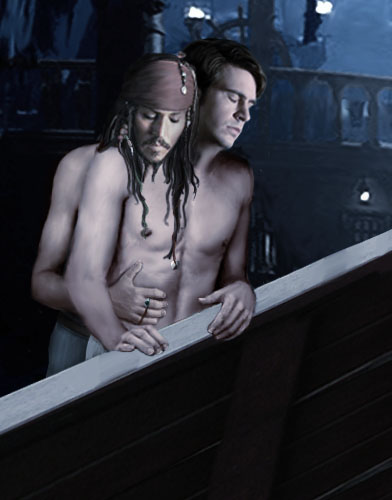
I duplicated the layer, and set the top one to "Soft Light" Then I adjusted opacity until satisfied with the look.
15.
Conclusion
To learn the program you wish to work with, it is the easiest to just play around. Take a picture, and have a look at the menues. Find out what does what. It's a simple trial and error procedure. Of course, there are tutorials which teach you certain features, and they are very useful, but to get a basic idea how the program works and what which option does, it is best to try it out; to see it "in action". For example, in this piece I knew from the beginning what I would do in Step 14, how to create the colour scheme for which I aimed. Therefore, I knew I would not have to bother much with colour before that.
This takes training, and seeing how a tool works in different situations. Don't be afraid to experiment—there is always the undo option to worship!
The key concepts of manipping I mentioned here are careful selection of shots and linking(please note that this is the term I used for it, it is not a professional term for the concept). It's about ideas and patience. "Skill" in terms of artistic talent just means one can do more; where painted elements replace photographs; it means you can create an expression for which you don't HAVE a photo, or alter a photo to look different. But if one keeps within the limits of photomanipulation, it is possible to make people drool without it.